
GTA 6's UI Is Dividing Fans: "Looks Undercooked" vs. Clean and Minimal
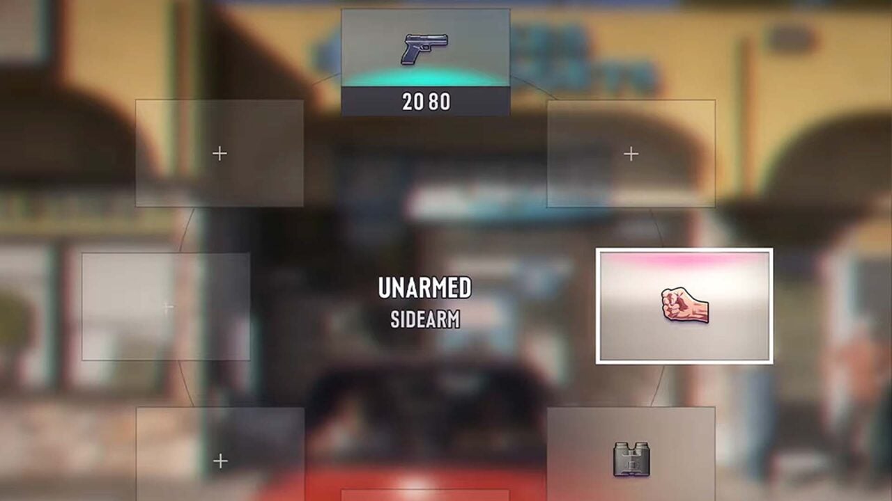
Grand Theft Auto 6 has been generating enormous hype, but one element of its recent reveal has split the fanbase right down the middle: the game's user interface. While many praised the overall presentation as "practically perfect," a vocal contingent of fans online has zeroed in on the HUD and weapon wheel, arguing that the UI looks too simple, cheap, or outright unfinished. Critics have used words like "undercooked" to describe what they see as a bare-bones design that feels out of place in what is expected to be one of the most technically ambitious games ever made.
On the other side of the debate, defenders of the UI argue that its clean, minimalist approach is a deliberate and welcome design choice, keeping the screen uncluttered so players can stay immersed in Rockstar's sprawling open world. The discussion reflects a broader tension in modern game design between players who want a rich, stylized HUD and those who prefer a less intrusive experience. With GTA 6 still on the horizon, Rockstar has plenty of time to iterate, and some fans are holding out hope that what was shown is not yet representative of the final product.
Key Insights
- 1Fans are divided over GTA 6's UI, with critics calling it 'undercooked' and 'too simple' while others appreciate its minimalist approach.
- 2The weapon wheel in particular has drawn negative attention from players who expected a more stylized or polished design.
- 3Despite UI concerns, the broader GTA 6 reveal was widely described as 'practically perfect,' making the HUD one of the few points of contention.
- 4Some fans speculate the UI shown may not be final, leaving room for Rockstar to refine it before launch.
- 5The debate highlights an ongoing tension in game design between immersive minimalism and expressive, feature-rich HUD design.
Sources
Advertisement
Comments (0)
Sign in to join the discussion.